Write Posts (Most) Anyone Can Read
Are you writing on Substack? Are your posts accessible? To be sure, make an accessibility checklist.
We're making a list, checking it twice, confirming that contrast ratio is nice, because people with disabilities are on Substack!
I just committed to starting this newsletter, and I’m making it as accessible as possible. I confess, even after doing the research, I’m not confident I fully know what I’m doing when it comes to making content accessible. And truthfully, there’s no such thing as 100% accessible. None of these are reasons not to try though.
In theory, I am a certified expert. Early in 2023 I got my CPACC, which stands for Certified Professional in Accessibility Core Competencies. It’s a great little certification, and I recommend it to everyone. It gives you an overview of different disabilities, assistive technologies, universal design, and the general laws worldwide that pertain to accessibility.
But, as I’m learning now, knowing is not the same as doing. I was overwhelmed by all the great resources out there on making content accessible, and there’s no way I’m alone. I love making complicated things simpler for people, so I made a checklist. Something I can use for every post.
The A11Y Project Checklist gave me a brilliant starting point. I also found the website Accessible Social to be very helpful. It has explanations for why we do a lot of these things. It also has resources for where and how to do them.
I pulled the items that are relevant to writing on Substack and created my own Substack Accessibility Checklist. If you’re a Google Sheets user, you’re welcome to copy mine to your own Drive and adapt it for your needs.
Substack Accessibility Checklist on Google Sheets
Now is a good time to point out that I’m not convinced Substack itself is fully accessible. On the one hand, it has good features. The layout for each Substack post is consistent and easy to follow. It’s also easy to post audio for each article, read in my own voice.
However, I ran “thecrawl.substack.com” through some accessibility checkers online, such as WAVE and the Google Lighthouse Chrome extension. These sites had quite a few notes for improvement for Substack’s underlying code. For a beginner coder like me, these notes were at a level beyond my comprehension. I can only hope Substack is aware and working on it.
My checklist focuses on what I can control as a writer. First, I’ll share the short list of eight things I’m doing to be more accessible. Then I’ll talk more about each step in depth, including recommendations and screenshots.
Test the colors for my site design, logo, and wordmark.
Use a consistent style.
Create a descriptive but succinct URL.
Use plain language and avoid figures of speech, idioms, and complicated metaphors.
Ensure linked text is descriptive and readable.
Is there a list? Describe the list ahead of time, including how many items are on it.
Create voiceovers.
Write alt text and descriptive captions for images.
Test the colors for my site design, logo, and wordmark.
All the work I put into designing a logo is wasted if people can’t see it. Color blindness affects about eight percent of the population, which is not a small amount. A bad color contrast ratio also makes your content unreadable, both to people with color blindness and to anyone with low vision, i.e. more and more of us as we age. Bad color contrast is also just annoying! Which of these two versions of my logo makes your brain hurt less:

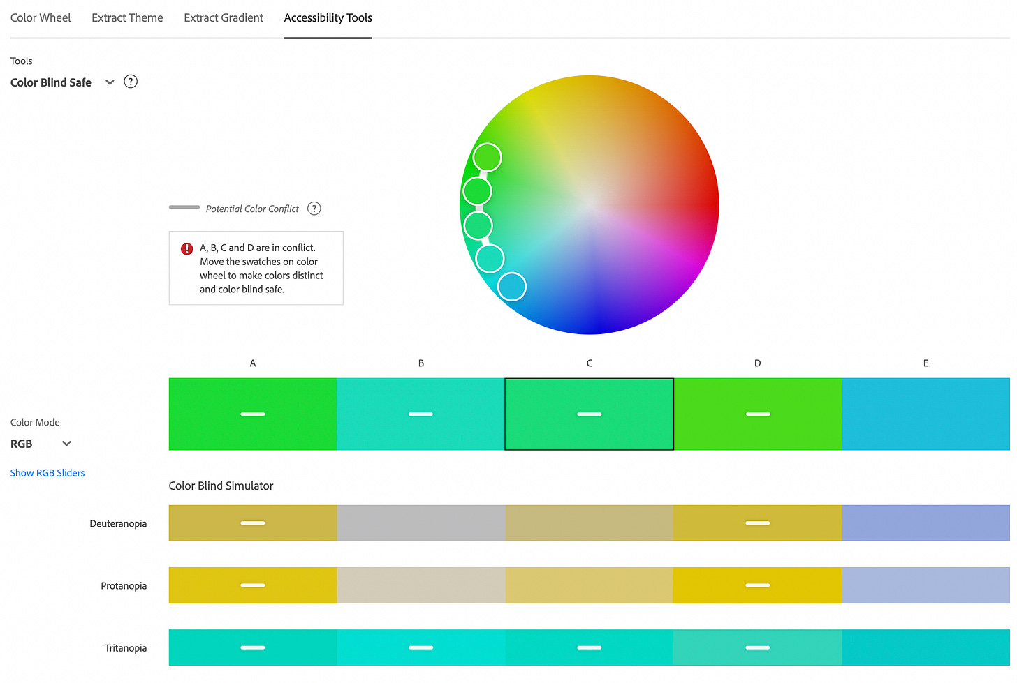
I love Adobe Color for this. Adobe Color has two accessibility tools. The Color Blind Safe Tool shows what your colors look like for different types of color blindness. It highlights when two colors are too similar and allows you to find an alternative.

And then the Contrast Checker will tell you if your text color is legible against your background color. A note on the checker - it defaults to AA, but I changed it to AAA. My Type A might be showing here, but if we’re not aiming for the best, then what are we even doing here?

Use a consistent style.
Substack makes this easy. It offers different heading styles - use them! They’re presumably keyed into the underlying code so it makes things easier for screen readers.
Create a descriptive but succinct URL.
Substack automatically makes the URL the title of your post. To see what I mean, look at the URL for my last post in my screenshot below.

That was the title I picked for the e-mail, but for the URL, I’d like something shorter and more descriptive. On Substack, you can change the URL (or “slug,” to use the industry parlance) in the Post Settings, under “SEO Options.” I can already tell that I will be doing this a lot.

Use plain language and avoid figures of speech, idioms, and complicated metaphors.
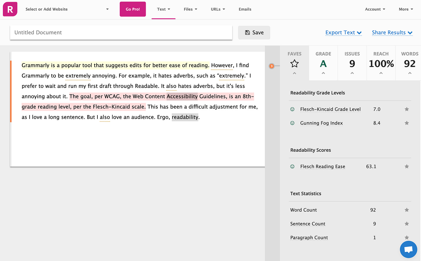
Grammarly is a popular tool that suggests edits for better ease of reading. However, I find Grammarly to be extremely annoying. For example, it hates adverbs, such as “extremely.” I prefer to wait and run my first draft through Readable. It also hates adverbs, but it’s less annoying about it. The goal, per WCAG, the Web Content Accessibility Guidelines, is an 8th-grade reading level, per the Flesch-Kincaid scale. This has been a difficult adjustment for me, as I love a long sentence. But I also love an audience. Ergo, readability.

Ensure linked text is descriptive and readable.
People do not like when linked text just says “click here.” Where’s “here”? Why do I want to go there? Tell people what the link links to. Color contrast also matters here. Substack allows you to pick the color for your links through your overall site design. I had originally picked a more muted blue, but found it was difficult to distinguish from black text.
Is there a list? Describe the list ahead of time, including how many items are on it.
A lot of what’s covered in the accessibility field isn’t just for people with disabilities. Accessibility makes things better for everyone. We describe an upcoming list, along with how many items are of it, for the people listening instead of reading. They can’t glance ahead at the list itself, so this orients them. But it’s also nice for the people reading to know what’s coming. I let you all know up top that there are eight sections to this article. Did that make this a little bit easier to read?
Create voiceovers.
I love how easy this is to do in Substack. I’m trying not to overthink it though. I should be fine with one read-through, recorded using my laptop’s built-in microphone. I’m not though, so I nabbed a little USB microphone through an Early Black Friday sale. And now I’m editing my voice recording on Audacity. It’s still relatively easy though, and kind of fun, if I’m being honest!
Write alt text and descriptive captions for images.
The internet says writing both alternative text and image descriptions is best, so I’m doing both. Alt text is short and lives in the metadata of the image. Whereas image descriptions are more descriptive and can be viewed by everyone. They’re also more fun to write. I’ve decided to put my image descriptions in the captions. Substack makes editing alt text and captions easy as well. Just click on the image, hit the three dots in the corner, and a delightful little menu pops up with both options, right there.

For more tips, here’s a great guide to writing alt text from Alexa Heinrich on the Accessible Social newsletter on Substack.
And that’s it for now! Someday I may do videos, and if so, I’ll need to figure out captions. But that day is not today.
Let me know if I’m forgetting something, or if there’s more I could do!


This is such a wonderful post. Curious: I've heard that it's important to use underlined links, not color links for accessibility. True?